

BRAND IDENTITY
SHIRE EQUESTRIAN
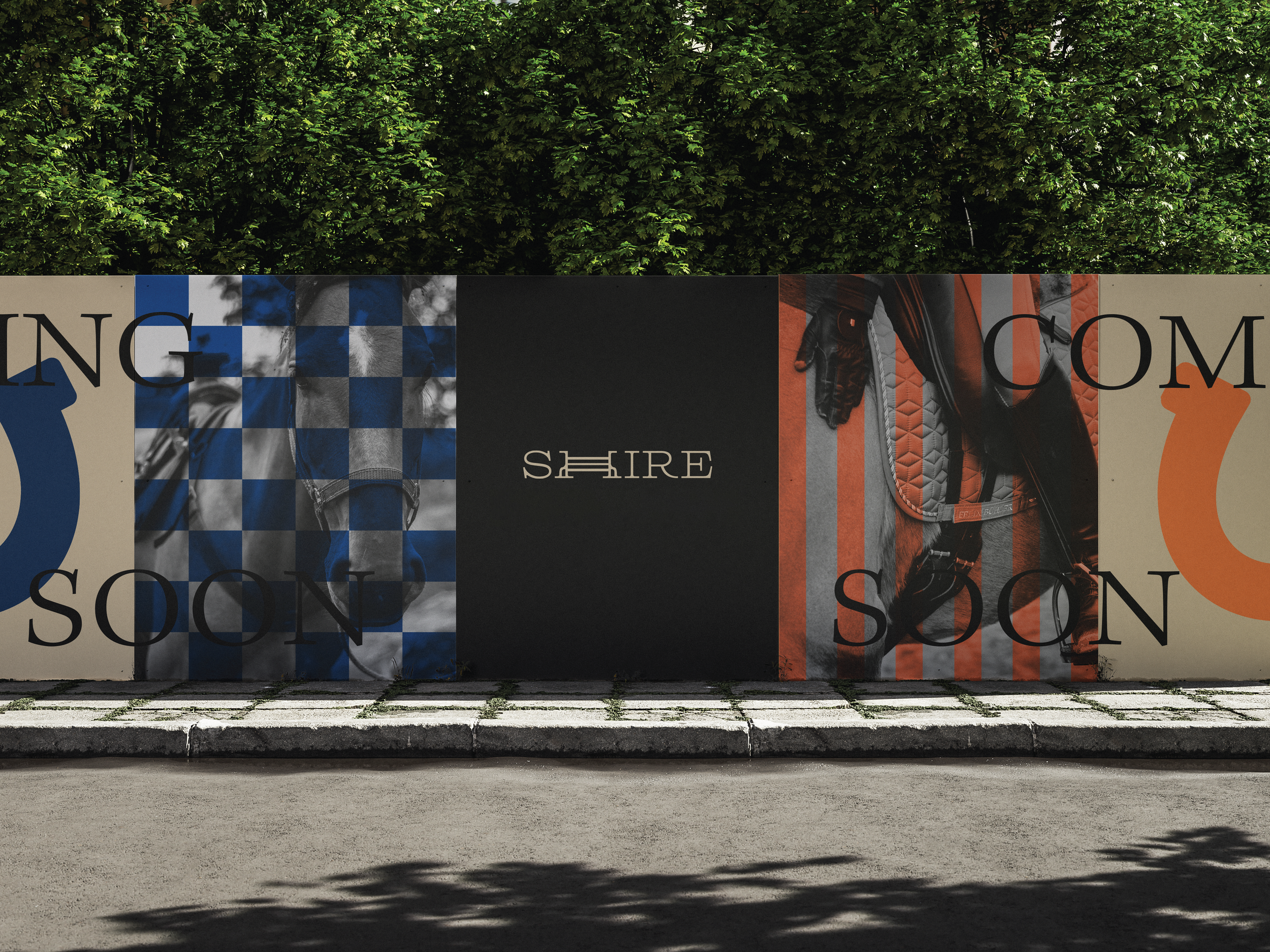
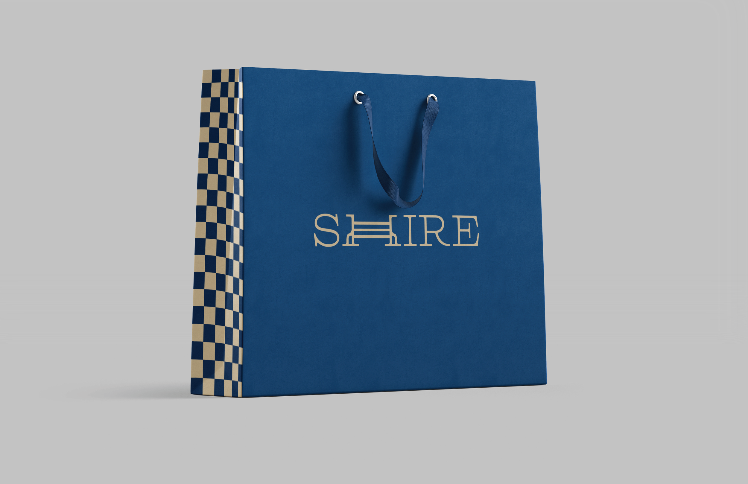
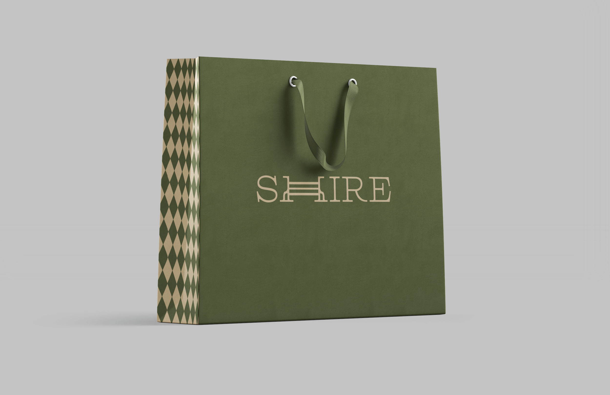
My Shires rebrand seamlessly blends luxury with equestrian tradition. Black and white photography, paired with silk-inspired patterns, adds depth and texture, while illustrated rudimentary icons create a timeless, sophisticated narrative. The custom logotype incorporates a horse jump obstacle into the “H”, symbolizing the brand’s deep connection to the sport. Minimalist packaging emphasizes clean elegance, reflecting Shires’ dedication to prestige, heritage, and craftsmanship. The color palette enhances the brand’s identity, with rich green and vibrant orange evoking the natural beauty of the equestrian world. Royal blue adds refinement and longstanding quality, while black and crème ground the palette with timeless elegance and versatility. A color-coded system reinforces the brand structure, creating a cohesive visual language that embodies Shires’ commitment to quality, tradition, and luxury.